Sunday, December 6, 2009

Illustrator Project #1: Seasonal Shopping Bags


Design Notes – Holiday Bag

-Shapes made to fill template & dashed line drawn

- First shoe drawn freehand with pen (drew outline first and details second)

-Second shoe is a reflected copy of the first shoe

-Christmas tree drawn with brush tool

-Star drawn with star tool & brush stroke applied

- Topshop in type

-Dress drawn freehand with pen

-Presents are squares with a 3d applied embezzle effect

-Ribbon was made from squares and pen tool

-Bow was made from star tool

-Plaid for handles was made using squares and Define Pattern. Handles were drawn with pen tool and then filled with plaid.

Design Notes – Fall Bag

-Shapes made to fill template & dashed line drawn

- First boot drawn free hand with pen

- Second shoe is a reflected copy of first shoe

- One leaf was traced with pen tool and copied twice, each leaf being filled with a different color. I then selected the three leaves and created a symbol, which I then used the symbol sprayer to distribute on both pages. I arranged the symbols behind some selected items, decreased the opacity for the leaves on the front of the bag, and used the symbol sizer to make some of the leaves at the bottom bigger than the other leaves.

- Jacket was traced with pen (drew outline first and details second)

-Topshop written in type

Design Notes – Spring Bag

-Shapes made to fill template & dashed line drawn

- Trench coat, umbrella, sunglasses, and dress were traced with the pen tool (for the dress I used two different steps to create the skin tone and the dress)

-Butterfly was traced with pen tool, copied twice, and each of the three butterflies were colored a different color. I then turned the three butterflies into a symbol and sprayed them.

- First flower was traced with pen tool and radial gradient was applied as fill. Second flower is a copy of the first.

- Topshop in type

Wednesday, October 28, 2009

PS Project #2: Print Ad Campaign


Design Notes:
Venice
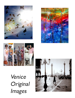
These images are layed out on top of each other in various opacities, also altering the saturation of the models to make them appear slightly more sepia in tone.
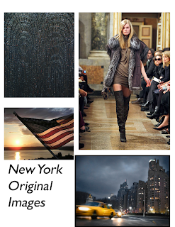
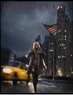
New York
The gothic facade image was used in a light opacity as a background to change the texture of the whole image.
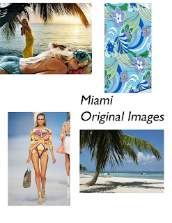
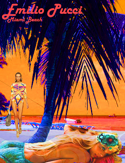
Miami
The hue and saturation of the image was altered to make the palm trees appear orange and purple, and the models to appear tanner. The fabric was used as an overlay on the model who is laying down.
Paris
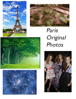
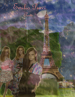
The starred image was used three times to create stars throughout the sky while still maintaining visible areas of clouds. I also cut out the Eiffle tower and pasted it into a new layer in order to put the trees into the background. I used the clone stamp tool to make the trees look less square and more like real trees, and also to create the sleeve and part of the models arm on the model with the black hair, so that her arm would not be missing like it was in the original photo. The pop-art image of the Eiffel Tower (pink lights) was overlayed to add a texture to the image.


Monday, October 19, 2009

Assignment 5 Color and Pattern Changes


The solid purple is the original Lanvin dress. The purple stripe is a pattern which I created, and the black and white is a preset pattern.

Wednesday, September 30, 2009

Poster Assignment


Design Notes


For my first poster, I began with the idea of integrating the New York skyline image into the sunglasses, as though the skyline was being reflected through the lenses of the glasses. I also spent some time cutting out the model and replacing her on top of the original image so that she would be in front of the text. I also used the eyedropper tool to make sure that the text was the exact same color as the sunglasses.

For the second image, the most drastic change is actually not visible because when I uploaded the image, it lost the color channel change. I had given the entire image a yellow tint. In this image, I also decided to make the skyline visible at the top and to orient Anna Wintour next to the model, rather than underneath her. I also decided to use verticle text instead of horizontal text. Also, I altered the scale of the sunglasses and placed them on Anna's face (which I saw to be appropriate because she is known for wearing big sunglasses indoors, especially at fashion week!) A challenge in accomplishing this task was that I had to remove the red arms of the sunglasses before I could place them on her face, which I did by using the eyedropper tool to sample the blues from the sunglasses and the paintbrush to paint over the red. I also increased the opacity of the sunglasses so that you could see Anna's eyes behind them. I increased the opacity of the model so that you could see the reflection of the skyline in the ocean appearing in the beams above the runway.


Monday, September 21, 2009

Wednesday, September 16, 2009

Wednesday, September 2, 2009

Monday, August 31, 2009